Criterion & Eclipse Cover Art & Packaging Babble-on Vol. 6
-
Big Ben

- Joined: Mon Feb 08, 2016 12:54 pm
- Location: Great Falls, Montana
Re: Criterion & Eclipse Cover Art & Packaging Babble-on Vol.
I can't believe they let The Squid and the Whale out the door. Love the design for Lone Wolf and Cub though.
-
sir_luke

- Joined: Sun Nov 03, 2013 9:55 pm
Criterion & Eclipse Cover Art & Packaging Babble-on Vol. 6
I've never seen the film, so is the super-negative reaction to the Squid and the Whale cover just because it's not representative of the film or do people have an aesthetic problem with it? 'Cause I actually really like the way it looks.
-
Andre Jurieu

- Joined: Tue Nov 02, 2004 3:38 pm
- Location: Back in Milan (Ind.)
Re: Criterion & Eclipse Cover Art & Packaging Babble-on Vol.
I think cover for The Squid and the Whale is another example of selecting one image that perfectly conveys the concept of the film.
-
domino harvey

- Dot Com Dom
- Joined: Wed Jan 11, 2006 2:42 pm
Re: Criterion & Eclipse Cover Art & Packaging Babble-on Vol.
"My favorite part of the movie is that shot where you can't tell who anyone is"
-
Minkin
- Joined: Thu Aug 06, 2009 11:13 pm
Re: Criterion & Eclipse Cover Art & Packaging Babble-on Vol.
Though some of you claim it to be too simple, I'm glad they went with Kurosawa's painting for Dreams. This is only the second time they've gone this route, correct? The other being Dodeskaden. When I saw the Rashomon premier, they had a plethora of Kurosawa's paintings on display, some were absolutely beautiful. I'm surprised they don't get better treatment (sometimes they show up in the booklet, I guess).
I'm not the biggest fan of the colors on Lone Wolf and Cub, but otherwise the image looks great. I might have wished that the babycart would be slightly more prominent, as that thing is loaded with hilarity.
I'm not the biggest fan of the colors on Lone Wolf and Cub, but otherwise the image looks great. I might have wished that the babycart would be slightly more prominent, as that thing is loaded with hilarity.
-
Graphist

- Joined: Thu Jul 23, 2015 2:18 am
- Location: New York City
Criterion & Eclipse Cover Art & Packaging Babble-on Vol. 6
For me the PDL cover still looks at the concept level, it is like it was put together hastily without much thought. The cover illustrations for OEJ and LWC are well done but the type on the latter is all wrong in my opinion. They could have tried harder for Noah's film cover, the proportions are all off. And last but not least, I understand “Dreams” cover depicts director’s painting but they could’ve definitely done a more refined work with it. I am still excited about its release though.
Last edited by Graphist on Mon Aug 15, 2016 7:21 pm, edited 1 time in total.
-
oh yeah
- Joined: Sun Jan 04, 2009 7:45 pm
Re: Criterion & Eclipse Cover Art & Packaging Babble-on Vol.
PDL is a disappointment because the possibilities were so ripe for that... some kind of abstract mash of colors would have been great, like the various ones we see throughout... but instead we get an awkward close-up of two giant heads. Bleh.
-
mfunk9786

- Under Chris' Protection
- Joined: Fri May 16, 2008 4:43 pm
- Location: Philadelphia, PA
Re: Criterion & Eclipse Cover Art & Packaging Babble-on Vol.
The NoahGraphist wrote:For me the PDL cover still looks at the concept level, it is like it was put together hastily without much thought. The cover illustrations for OEJ and LWC are well done but the type on the latter is all wrong in my opinion. They could have tried harder for the Noah's film cover, the proportions are all off. And last but not least, I understand “Dreams” cover depicts director’s painting but they could’ve definitely done a more refined work with it. I am still excited about its release though.
-
CSM126

- Joined: Thu Nov 04, 2004 8:22 am
- Location: The Room
- Contact:
Re: Criterion & Eclipse Cover Art & Packaging Babble-on Vol.
That's weird, I never knew Squid and the Whale was adapted from Infinite Jest.
-
Graphist
- Joined: Thu Jul 23, 2015 2:18 am
- Location: New York City
Re: Criterion & Eclipse Cover Art & Packaging Babble-on Vol.
Thanks for correcting. It was a typo.mfunk9786 wrote: The Noah
-
swo17

- Bloodthirsty Butcher
- Joined: Tue Apr 15, 2008 10:25 am
- Location: SLC, UT
Re: Criterion & Eclipse Cover Art & Packaging Babble-on Vol.
The Squid and the Whale shows a family divided, each person isolated in their own quadrant, and still squabbling with each other even at that distance. Jeff Daniels looks like he's halfway between serving and walking out. I think it works.
And that image from Punch-Drunk Love works wonderfully in the film though I'm not sure how well it translates to a cramped still image.
And that image from Punch-Drunk Love works wonderfully in the film though I'm not sure how well it translates to a cramped still image.
-
mfunk9786
- Under Chris' Protection
- Joined: Fri May 16, 2008 4:43 pm
- Location: Philadelphia, PA
Re: Criterion & Eclipse Cover Art & Packaging Babble-on Vol.
It is somehow worse now. Please try to use full and/or last names here unless you're a buddy of the person in questionGraphist wrote:Thanks for correcting. It was a typo.mfunk9786 wrote: The Noah
-
JayAlmighty

- Joined: Sun Aug 17, 2014 10:24 pm
Re: Criterion & Eclipse Cover Art & Packaging Babble-on Vol.
One-Eyed Jacks
Great cover. Wouldn't change a thing
Dreams
Unless I'm mistaken, I'm pretty sure that the image used in this cover is one of Kurosawa's hand-drawn storyboards. Either way, it looks great. Simple and beautiful.
Lone Wolf & Cub
Amazing artwork in this cover, but I can't help but think that the text should be in a different, more contrasting color (like white.)
Punch-Drunk Love
Considering that this is one of my all-time favorite films, I'm a little disappointed in this cover. While it does match the aesthetic of the film, it's rather boring, probably the result of some sort of contractual obligation that required that the actors be on the cover.. Personally, I would have just slapped any one of Jeremy Blake's amazing abstract images on the cover and called it a day.
The Squid and the Whale
Yikes. Not only does this image do poor job of reflecting the film (it's framing suggests that Jeff Daniels is the main character - a better image would be one where the cast is closer together, one that reflects the dysfunctional family dynamic), it's also very bland and muted. Additionally, that text is way too thick and way too cluttered. Overall, it's easily my least favorite cover of the batch.
-
Andre Jurieu
- Joined: Tue Nov 02, 2004 3:38 pm
- Location: Back in Milan (Ind.)
Re: Criterion & Eclipse Cover Art & Packaging Babble-on Vol.
Somehow I'm not sure that prominently displaying the faces of the actors in The Squid and the Whale is really going to significantly improve the artistic or financial impact of the film. If anyone is going the spend money on a Criterion Collection edition of this movie at this point in time within the marketplace, I'm fairly certain they are familiar with the movie. I doubt anyone is searching frantically for all the Jesse Eisenberg, Laura Linney, Jeff Daniels, or Owen Kline movies they can find on blu-ray.
Not sure I agree with that statement. The film relies heavily upon the fact that Bernard is - or at least was at some point - a prominent figure within the New York literary community, and that Walt still maintains this delusional perspective of his father. It's a film about divorce where the lines of combat are initially drawn very distinctly within the family, and where Bernard's ego soon begins to further isolate him from the rest of the family, to the point where he loses any clarity in regards to what his role is within the family beyond his eroding status as an elite intellectual who was once the center of the household.Graphist wrote: ... They could have tried harder for the Noah's film cover, the proportions are all off...
Last edited by Andre Jurieu on Tue Aug 16, 2016 4:40 pm, edited 1 time in total.
-
domino harvey
- Dot Com Dom
- Joined: Wed Jan 11, 2006 2:42 pm
Re: Criterion & Eclipse Cover Art & Packaging Babble-on Vol.
None of the existing posters or DVD covers for Squid and the Whale are particularly good, but there had to be fifty other, better options for how to illustrate the tennis match if that's what they wanted to go with
-
Jeff

- Joined: Tue Nov 02, 2004 9:49 pm
- Location: Denver, CO
Re: Criterion & Eclipse Cover Art & Packaging Babble-on Vol.
They are all fantastic, but The Squid and the Whale is the best of all, for the reasons swo and Andre already pointed out. An entire ethos distilled to one frame, beautifully composed.
-
swo17
- Bloodthirsty Butcher
- Joined: Tue Apr 15, 2008 10:25 am
- Location: SLC, UT
Re: Criterion & Eclipse Cover Art & Packaging Babble-on Vol.
Also, all the blue kind of makes them look like attractions in an aquarium.
-
Graphist
- Joined: Thu Jul 23, 2015 2:18 am
- Location: New York City
Re: Criterion & Eclipse Cover Art & Packaging Babble-on Vol.
Andre Jurieu, I should’ve been more specific about “The Squid and the Whale” cover. I was mainly talking about the type treatment.
-
perkizitore

- Joined: Thu Jul 10, 2008 3:29 pm
- Location: OOP is the only answer
Re: Criterion & Eclipse Cover Art & Packaging Babble-on Vol.
Spot on, although I have to add that Dreams is pretty decent too.domino harvey wrote:Lone Wolf looks great, One Eyed Jacks is negligible, the other two are awful
-
Randall Maysin

- Joined: Tue Apr 02, 2013 12:26 pm
Re: Criterion & Eclipse Cover Art & Packaging Babble-on Vol.
They are all completely unremarkable. Sure, some may be slightly better than others or have some mildly more or less pleasing elements, but there is only so much wiggle room in the realm of utter mediocrity and cluelessness.
-
Cremildo

- Joined: Sun Jan 22, 2012 8:19 pm
- Location: Brazil
- Contact:
Re: Criterion & Eclipse Cover Art & Packaging Babble-on Vol.
I don't see anything mediocre in the Dreams cover. It's beautiful and apt without being ostentatious. I wasn't really interested in upgrading it. Having seen the art, now I am.
-
Andre Jurieu
- Joined: Tue Nov 02, 2004 3:38 pm
- Location: Back in Milan (Ind.)
Re: Criterion & Eclipse Cover Art & Packaging Babble-on Vol.
That's actually one of the few shots during the opening tennis match with all four family members within the frame. Most of the other shots are pairings or isolate a specific character (which is likely somewhat due to the logistics of filming a sport with actors who are not incredibly skilled or comfortable with the activity). There is one other possible frame they could have used, but if their intention was to convey Bernard's misconception of his own stature, this image currently used for their cover art is likely the better choice. The only other image that would work is the children watching their parents squabbling on the other side of the court, which wouldn't necessarily communicate the fundamental issue with Bernard's ego, or that dynamic already established within the family where the children have already chosen sides with specific parents.domino harvey wrote:... but there had to be fifty other, better options for how to illustrate the tennis match if that's what they wanted to go with
Agreed. Also, the size of the title hanging over the family works well to capture Walt's childhood fear of the statues at the natural history museum of the squid and the whale. It's one of the reasons I'm a bit perplexed by the outrage at the fonts and the proportions of the title (which are very similar to the actual title within the film). These aspects seem very well thought out in my opinion.swo17 wrote:Also, all the blue kind of makes them look like attractions in an aquarium.
-
cdobbs
- Joined: Tue Jul 28, 2009 12:45 am
Re: Criterion & Eclipse Cover Art & Packaging Babble-on Vol.
A take-off on Pink Floyd's The Wall might have been appropriate for Squid and the Whale.
-
Finch

- Joined: Mon Jul 07, 2008 5:09 pm
- Location: Edinburgh, UK
Re: Criterion & Eclipse Cover Art & Packaging Babble-on Vol.
I am a huge fan of Lone Wolf & Cub, the film series and the comics. I actually wrote four scripts based on the rest of the comics the Japanese did not adapt in the 70s. Even went to the trouble of designing front covers and getting a Japanese friend to translate the titles of each film into Japanese so I could put the characters on to the front sheets. If I was fluent in Japanese and had the clout and talent like Kenji Misumi (and the money), I'd go to Japan and live there for a few years to make four more films in the spirit of the original six movies, casting someone like Tomisaburo Wakayama in the lead.
The Criterion cover disappoints me. I find the colours too loud and the font is completely wrong for this. I know the films have a reputation for being exploitation cinema but the font and even the colours feel a bit cheap. The drawing itself is lovely but that's the release I'm looking forward to the most for November and the final cover doesn't feel right. Maybe I'll like it when I have the set in my hands.
I like the shot chosen for The Squid and the Whale. Didn't expect the film to get a 4k restoration so that was a pleasant surprise.
-
dwk

- Joined: Sat Jun 12, 2010 6:10 pm
Re: Criterion & Eclipse Cover Art & Packaging Babble-on Vol.
Paul Pope has posted some more LW&C art on twitter.
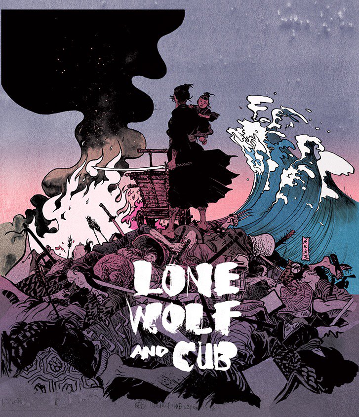

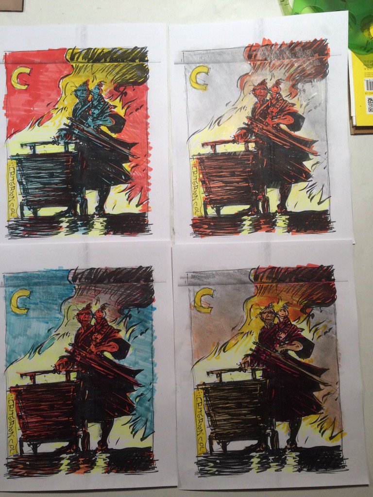
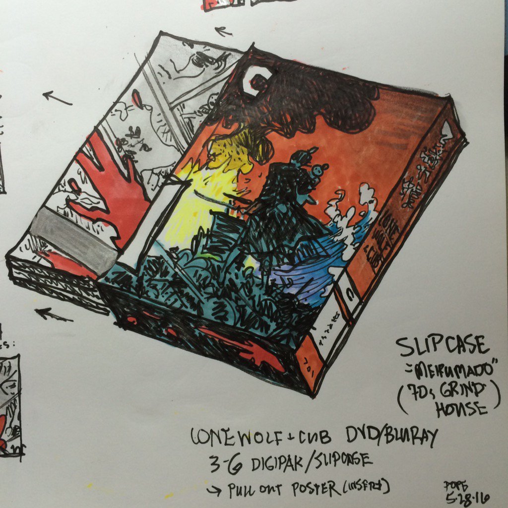

And one more from instagram:

Final stages of Lone Wolf Boxset @Criterion http://bit.ly/2aWDrvN" onclick="window.open(this.href);return false; here's cover colors by @RaynardFaux w/my logo
@RaynardFaux interpreted my initial hand-colored palette for final Lone Wolf cover @Criterion
And one more from instagram: